boxElementElementElement functions can be customized with set and show rules.
set and show rules.An inline-level container that sizes content.
All elements except inline math, text, and boxes are block-level and cannot occur inside of a paragraph. The box function can be used to integrate such elements into a paragraph. Boxes take the size of their contents by default but can also be sized explicitly.
Example
Refer to the docs
#box(
  height: 9pt,
  image("docs.svg")
)
for more information.
ParameterParameterParameters are input values for functions. Specify them in parentheses after the function name.
box(,,,fill:,,,,,clip:,)->The width of the box.
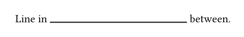
Boxes can have fractional widths, as the example below demonstrates.
Note: Currently, only boxes and only their widths might be fractionally sized within paragraphs. Support for fractionally sized images, shapes, and more might be added in the future.
Show example
Line in #box(width: 1fr, line(length: 100%)) between.
Default value: auto
The height of the box.
Default value: auto
baselineSettableSettableSettable parameters can be set using the set rule, changing the default value used thereafter.
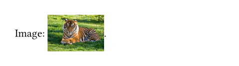
baselineset rule, changing the default value used thereafter.An amount to shift the box's baseline by.
Show example
Image: #box(baseline: 40%, image("tiger.jpg", width: 2cm)).
Default value: 0% + 0pt
radiusSettableSettableSettable parameters can be set using the set rule, changing the default value used thereafter.
radiusset rule, changing the default value used thereafter.How much to round the box's corners. See the rectangle's documentation for more details.
Default value: (:)
insetSettableSettableSettable parameters can be set using the set rule, changing the default value used thereafter.
insetset rule, changing the default value used thereafter.How much to pad the box's content.
This can be a single length for all sides or a dictionary of lengths
for individual sides. When passing a dictionary, it can contain the
following keys in order of precedence: top, right, bottom, left
(controlling the respective cell sides), x, y (controlling vertical
and horizontal insets), and rest (covers all insets not styled by
other dictionary entries). All keys are optional; omitted keys will use
their previously set value, or the default value if never set.
Relative lengths for this parameter are relative to the box size excluding outset. Note that relative insets and outsets are different from relative widths and heights, which are relative to the container.
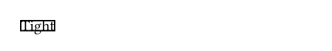
Note: When the box contains text, its exact size depends on the current text edges.
Show example
#rect(inset: 0pt)[Tight]
Default value: (:)
outsetSettableSettableSettable parameters can be set using the set rule, changing the default value used thereafter.
outsetset rule, changing the default value used thereafter.How much to expand the box's size without affecting the layout.
This can be a single length for all sides or a dictionary of lengths for individual sides. Relative lengths for this parameter are relative to the box size excluding outset. See the documentation for inset above for further details.
This is useful to prevent padding from affecting line layout. For a generalized version of the example below, see the documentation for the raw text's block parameter.
Show example
An inline
#box(
  fill: luma(235),
  inset: (x: 3pt, y: 0pt),
  outset: (y: 3pt),
  radius: 2pt,
)[rectangle].
Default value: (:)
clipSettableSettableSettable parameters can be set using the set rule, changing the default value used thereafter.
clipset rule, changing the default value used thereafter.Whether to clip the content inside the box.
Clipping is useful when the box's content is larger than the box itself, as any content that exceeds the box's bounds will be hidden.
Show example
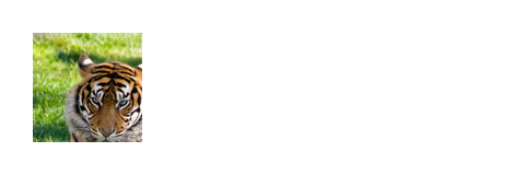
#box(
  width: 50pt,
  height: 50pt,
  clip: true,
  image("tiger.jpg", width: 100pt, height: 100pt)
)
Default value: false