circleElementElementElement functions can be customized with set and show rules.
set and show rules.A circle with optional content.
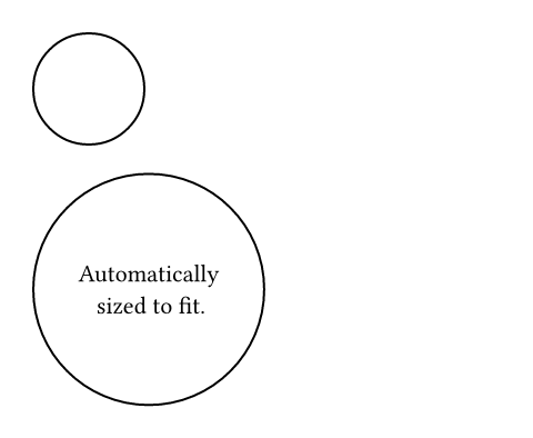
Example
// Without content.
#circle(radius: 25pt)

// With content.
#circle[
  #set align(center + horizon)
  Automatically \
  sized to fit.
]
ParameterParameterParameters are input values for functions. Specify them in parentheses after the function name.
circle(,,,fill:,,,,)->radius
radiusThe circle's radius. This is mutually exclusive with width and
height.
Default value: 0pt
The circle's width. This is mutually exclusive with radius and
height.
In contrast to radius, this can be relative to the parent container's
width.
Default value: auto
The circle's height. This is mutually exclusive with radius and
width.
In contrast to radius, this can be relative to the parent container's
height.
Default value: auto
insetSettableSettableSettable parameters can be set using the set rule, changing the default value used thereafter.
insetset rule, changing the default value used thereafter.How much to pad the circle's content. See the box's documentation for more details.
Default value: 0% + 5pt
outsetSettableSettableSettable parameters can be set using the set rule, changing the default value used thereafter.
outsetset rule, changing the default value used thereafter.How much to expand the circle's size without affecting the layout. See the box's documentation for more details.
Default value: (:)
The content to place into the circle. The circle expands to fit this content, keeping the 1-1 aspect ratio.
Default value: none